Friday, April 30, 2010

S!n CiTY... ((SK3TCHinG ScavEnG3R HUnT))


Grandpa Swinger - (( this is a 1950's Dodge Swinger))


The things you do for love...
this is my pimped out 1950's DODGE SWINGER "Bonnie & Clide-Mobile"
Im OBSESSED with old black and white action or historical movies, so when the opportunity to pick a car o pimp out was given I searched for cars that are featured in my favorite genre of movies! I tried to give it a sin city feel because I love the cars and feel of that movie. I chose to make it red because red is the color of passion....and Passionate emotions are always the most exciting!


Saturday, April 24, 2010

H/\Rd LiViNG : STUDIO APARTMENT DESIGN


H/\Rd LiViNG : I have designed a grundgy, fashion forward studio apartment strictly designed for photographer STEVEN MEISEL
This is a photo from Vogue magazine shot by Steven Meisel in 2007 for their fall prints collection. I was inspired by his work entirely and created patterns & color schemes from many of his photographs
This is a color scheme that I created from the photograph shot of the woman above
This grundy photo: also shot by Steven, was one of the main insiprations for the materials that I had chosen to use in the "studio apartment" that I have designed.
Above is a double page sketch book spread that I had done strictly Steven Meisel inspired. I created 7 different color schemes from the 7 different photos that where shown in the 2007 Vogue spread
I created my vision and design of my Steven Meisel inspired studio apartment on Sketch up: a computer program that is designed to build.
An arial view of the bedroom loft which is elevated on a wooden platform and closed off with tinted retractable glass doors. Also this shot shows the entrance way to the photography studio that has a built in catwalk.
Another arial view of : the loft, photography studio #1 & 2, as well as the bathroom
Over all, Stevens harsh - couture style photography inspired all aspects and elements of of design process. I decided to use tough, practical building materials such as brick, cement, glass and steel to give the apartment a more masculine feel. I embraced & celebrated these building materials using them in the key factor of my design. I wanted to use the harsh look as a part of the decoration: "Celebrating the foundation." Because sometimes the body of the structure is the most beautiful... and i'd rather not hide that part.

Thursday, April 22, 2010

F()r Th3 L0v3 Of C()fF3eeeee .... (( SK3TcHInG ScaVEnGEr HunT ))

This is the place I decided to sketch for clue one. If you know me well you know that Im addicted to coffee!!! : Venti, White Chocolate Mocha, Iced!... NO WHIP CREAM! There is the one black girl with short hair and glasses. She always wears a hat. you cant miss her! ... : | >>> Lets just say I think I age 10 years every tuesday. I decided to sketch on the brown paper bag that they always pack my bagel in (( just because a blue berry bagel [with butter] is such an important factor in the field trips that Dajana, Daniel and I always make to starbucks)) ... Do you see the largest sketch at the top of a girl?? >> Well all I have to say is mission accomplished! I had been siting directly across from her.. and I noticed that she noticed that I was sketching her... after about 8 minutes of txting, closing her eyes ((i guess she was trying to wish the creepy art girl away)) and PRETENDING to study.. she packed up her things and left!! I would have to say that, that was the first time I have actually scared someone away. It only took me the entire freshmen year... but I would say a job well done! LOL... I decided to name this piece for the love of coffee because I you haven't noticed yet... there is a long line of people at the bottom of my sketch book page....(( its an understatemet...))

Sk3Tch!nG 1()1 >>> (( Skectching Scavenger Hunt))

This is sketch clue number one:
The first public space on campus that i would say is probably my favorite is the lecture room in the Wither Spoon Museum. This is where my art 101 class is. I adore art, architecture and I love a little dry humor!! >> Dr.Richard Gantt is my professor and he is the reason why I enjoy attending every single class on Tuesdays and Thursdays!! I know, I know, its kinda disturbing that I actually look forward to going to a History class!!
He's good at his job and he is very professional. The thing that I love most are the little stories that he always has with each artist, piece of art or an architectural monument.
In the sketch, there are kids in the front row (awake), Kids in the back row (napping) , and funny little quotes and rules that we made up especially for this class.
If you ever take art 101 with Dr. Gantt... NEVER leave the class to blow your nose, NEVER go to the bathroom, and DONT YOU DARE COME INTO CLASS: he will crush you. He said that he will fight to the death.. and look.. He's still here.
The combination of his interesting little stories and his dry; but not intentional humor make me an excellent student in his class. (( Thank you Dr. Gantt))

P.s >> play on words.... I named it Sketching 101 for a reason! enjoy.

Thursday, April 8, 2010

JuST a LiTTl3 BiT EXTRA..


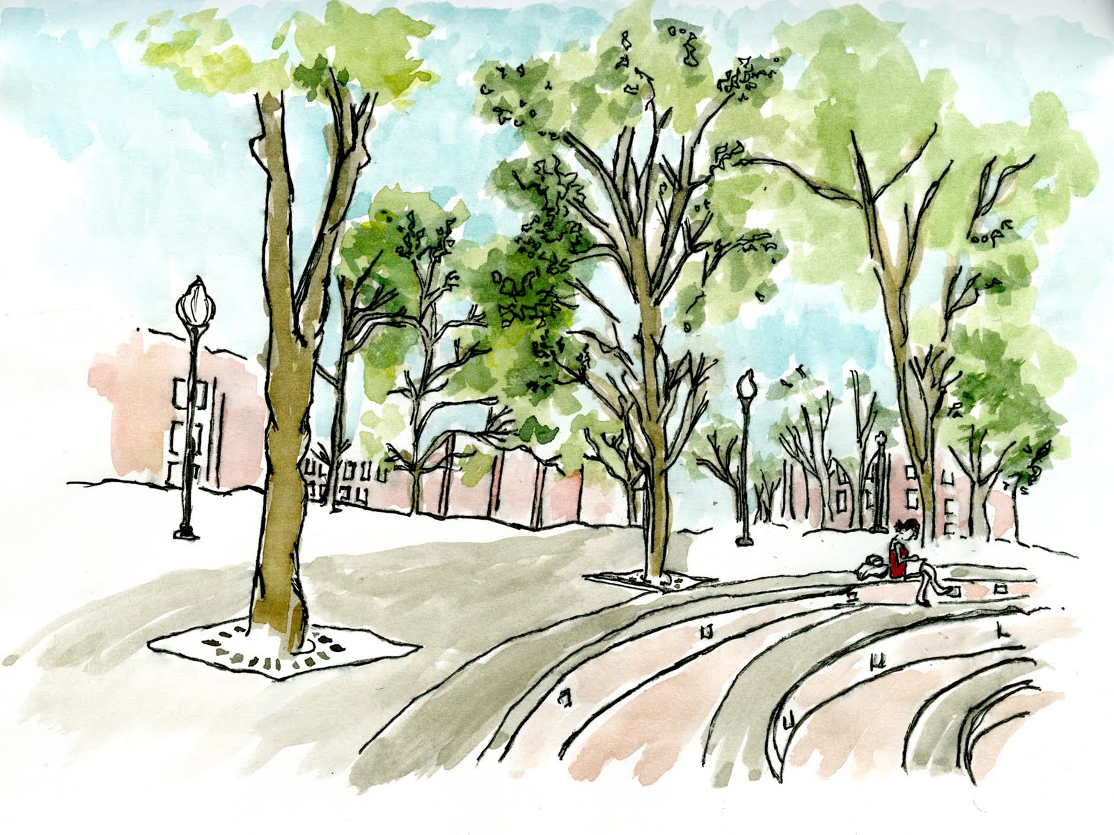
This is an extra credit water color piece that I have done for my drawing class... This is a perspective that is looking down gray drive from the top stair of the fountain outside of the caf!... P.s my Scale figure is my hunie pie NEDDIE! :D >> (Dajana Nedic)

Saturday, April 3, 2010

()n ALL FOuRS...


Furniture designed by MOI!! :) > believe it or not... this was done with my trusty dusty chart pack markers, pencil crayons and a pen!!! > A-MA-ZING right????!!?

Wednesday, March 17, 2010

H!Gh-GRaD3eeeee


1.water color painting , 2. drawing in pen, 3. cohesive layouts, & 4. DRAWING TREES.
I decided to title this one high grade because it is the Jamaican word for Tree's. Most people recognize it as mary jane but i don't think it would have the same effect.

Believe it or not, I'm just as bad at drawing trees as i am drawing people. BUT! practice makes perfect don't you think?? >> the piece simply speaks for it self!


BiLL!()Ns ()F BUTTONS :D !


I'M OBSESSED WITH BUTTONS. THE END. : )

G!MMi3 DETaiLs...

This is a cohesive collage of details that I had drawn in several locations. including: brick (( exaggerated and modified to my personal style)), a door knob, light fixture, wall paper and one of the famous beams in the Interior Architecture building!

Wednesday, March 3, 2010

EMPtin3SS...


FLiGHTs...

This is a piece I have created which has been inspired by the image below. I named it flights because it is a series of flights of stairs (even though I only chose to draw one.) The media I used was chalk pencils on gray-ish brown canson paper. This is a depiction of the staircase in the E.U.C of UNCG leading to the information desk.
By : Cathy Johnson

Wednesday, February 24, 2010

Color me black and white...

These are what I like to call thumb nail thoughts. These are little moments that I have captured within the E.U.C building using thumbnails. I actually enjoyed this! It was actually amusing to sit in on a small snip-it of time, of peoples lives who I dont know. Lol it was also very hard to blend in and make sure that people didnt catch me sketching them! (creepy girl in the corner)> I've got some great stories from this exercise. : )

Thursday, February 11, 2010

ATHENA my W/\t3r ColoUReD G()DD3SS of WaR + Wisd()M

This is my final piece: an 18x24 watercolor composition of Athena Parthenons. I am in love with my final product! I decided to use colours in the same family and used accent colors such as the turquoise-ie color of the sky, red in her necklace and the Green in my interpretational drawing of Athena. Its funny because if you havent noticed her brazier is perfectly shaped. > many people who have views it often comment on them! : )... i agree with them.


I love my water color set! (bottom right) It brings the simplest ink drawings to life. > yeaaa i drew this in pen!


This is before I painted it... just to give you an idea of what it looked like with out color.. mehhh! boring right??

Tuesday, February 9, 2010

ThUMbNaiL TH()uGHTS...

This is a double page in my sketch book that shows possible layouts for my design board on ATHENA of PARTHENON
This is my FAVORITE composition. It shows the olive tree that Athena planted in the back of the Parthenon. As well as the eroded Parthenon, and a section of the statue of Athena with an interpretational drawing of her shield with the serpent.
I also love this layout! This is a section of the statue of Athena. It shows the frieze at the bottom left of the base as well as the bottom of Athena's "aegis" showing her sandals.
This is a simplistic layout. Here is Athena placed in-front of her shield holding her spear and a shoal that changes into the serpent. The text would go onto the shield as well as in the blank space. I feel its simple but it works and that is why i love this one as well. I kind of wish i could do all of these layouts!
This is the final layout of "the favorites." This one shows the most detail and tells the best story. Here is Athena holding her spear, in-front of her shield, standing over the Mediterranean sea. In the distance is the Parthenon siting on top of the Acropolis. In the right hand top corner is a doric column and there is a greek stylized design that allocates space for the text.

Monday, February 8, 2010

HELP HAITI

This is an interpretational watercolor painting of the make shift Haiti Homes in the entrance of the I.A.R.C building on the first floor. I decided to add a bit of personality to the scene by making Tracy (teachers assistant) a homeless girl > in the yellow shirt. And Suzanne's (the professor) hair cut inspired the little boy in the green shirt. Yes, they were siting in the scenery (they were drawing). I just decided to incorporate their presence as characters in this piece. I love this piece because i feel that it expresses feeling and emotion and tells a story even though that story came from card board boxes and scrap wood.

Tuesday, February 2, 2010

SH()w & T3LL

C()loUR M3 COUTURE


This is a photograph taken by Alex Masters (Bermuda) of one of my closest friends; Alyssa. Even when she's being silly she can still manage to be beautiful! its annoying [ in a good way] .. but my point is that she is my inspiration for the water color piece that I created above. This picture was taken in August 2009 on a boat for a summer photo shoot. Believe it or not this was a picture from the behind the scene photo album!
This is an image i found on google [ my bestfriend]. when i need inspiration. google is there. This photo helped me create an atmosphere and a scene that best fit the photo that I picked of lyssa.

BeaCH BUm


This is a photograph I took at a beach in Bermuda (my country), in the summer of 2008. The beach is called or known as Clearwater. I was there one afternoon with my friends on a special holiday known as "Cupmatch." This photo is one of my favorites! I love the contrast between Rebecca's swimmer body (my friend, & no really, she's a swimmer!) and the pleasantly plump man that she shares the photo with. This photo just happened to be the stimulus or the "inspiration" for the water color piece I created just above.
I cant help but to chuckle to my self because I specifically told her to walk in the mans direction just so that I could get his photo. [without coming off as creepy! : S ... how weird would it be if some random teenager was snapping photos of you at the beach??!] ... but never the less I gave him 5 stars for his confidence and a 10 out of 10 for this photo! it came out great! > p.s the brown legs on the right side of the painting are mine! i couldn't help my self i just had to put myself in it some how!

ThR33's a CR()WD. : )


This is a sketch book page that i created for a homework assignment. we had to select, draw and water color 3 accessories of our choice : Daja's ((my friend)) scarf, Shareece's Stomach piercings and my ear piercings. >> no my hair is not red. I just throughly enjoy exaggerating objects with color. > IT GiVES PERSONALITY!