Sunday, August 1, 2010

C(o)nCR3tE JunGL3


As a prominent fashion lover, I often buy magazines such as vogue, seventeen, cosmo girl & teen vogue. After indulging in all of its retail pleasures I sort the magazines into brand, month and year : basically i'm a collector of fashion magazines!
Beyond the fact that I collect magazines, I have created a hobby out of making collages out of magazine cut outs.
I have named the collage below : concrete jungle
Along with magazine ads, I used permanent marker to add detail, dried vein leaves and dead flowers from the corsage that I wore to my 2007 junior prom
I used this photo because I loved the deep colors and how its grundy look contrasted against the pink roses. The dark feel also compliments the fact that I used dead flora.
I kept the basis of the colage black and white to emphasize the "concrete"
I adore how realistic the girl looks in this photo.. how the light hits her hair. Such a strong photo for such a simple collage... this has got to be one of my most favorite collages yet!

Sunday, July 18, 2010

SuMM3R J()bs...

To this day I have sworn that i would never, ever, EVER work behind a desk > Permanently. Which is why I have chosen the field of work that surrounds art and liberal freedoms. But sadly this summer has imprisoned me behind a desk inside of a little cubicle, performing the horrible task of filing. After about a few weeks and some change I prayed to the heavens that I would never have to see a paperclip, a scanner or a manila colored folder ever again in life until I heard the horrors of working at a summer day camp. Even though I hate making 8:30 am every morning to my white collared job, I sulk with a smile because I'm not the one who has to watch other peoples' kids! :)
I love children... when they're not my own. (not that i have any, but i plan on having kids light years from now) My friend who works at a camp has told me many horror stories that have made me much more appreciative of my summer job! There is always that one kid that gives you hell.
This is a drawing i did while on a "break" ... a constant reminder in my note pad that someone always has a worse job than you do!
So thank you manila files for saving my sanity.

Monday, June 21, 2010

LiV3 LiF3 t() CR3ATE


Over the years I have been a collector of things, especially MAGAZINES!
My favorite: Seventeen! ♥
This past wednesday I did the grocery shopping for my dad and I picked up this months edition of seventeen magazine. During my flip through of the pages I came across this converse ad that I had previously ripped out of another magazine to pin up on my desk at the studio.( Converse are also known as chuck taylors : for the 80's babies!)
"Live Life To Create."

One of the shortest, simple quotes but it means the most! Its refreshing, youthful and PERFECT for summer!
I created a double spread in my sketch book using the add, some buttons, hot glue and some flowers from an artificial lay that I got from a beach party once.
I wanted to point out that the back ground behind the larger portion of the flowers is graffiti. I love the contrast between the artificial delicacy of the pink flowers against the harsh look of the graffiti magazine paper.
Its almost like a beachy summer meets the concrete jungle!

Sunday, June 20, 2010

Inspire in Mind..

I have a confession :
I have been back home for the summer for almost a month and some change and the first time i opened my sketch book was about a week ago! :s
Due to the recent discovery of the neglect that i have shown towards my sketch book, pens, chart pack etc.. I have been followed by an ugly cloud of guilt.
But do you want to know what the most ANNOYING thing is about this whole situation is??
I was surrounded by beaches, the most interesting characters to sketch and the most gorgeous colors of summer and I still had not found the inspiration to motivate me enough to pick up my inky pen and draw or even BLOG! Until I found this photo that I had taken months ago in the studio, at my desk of a few of my favorite things... If you ever want to know me as a person or designer... this photo SCREAMS it all.

1. My inky pens: I never go any where with out them. If they havent got ruined in the wash from their normal vacation spot in the pockets of my jeans, you can usually find them in my satchel or the crafty "sleeping bags" that you see in the photo above. The pen is a huge part of my technique of design because one of the most wonderful professors that I have ever had (suzzane c.), never allowed us to use pencil... TALK ABOUT GIVING ME A HEART ATTACK! All i ever used where pencils, because of the security of an eraser! Using a pen has shaped and formed me into a much more confident and skilled drawer. And I must admit that when I go to draw... well LEISURELY draw I only use pens!

2. My paint brushes and My pocket sized water color traveling set!: This one is short and sweet.. If you already know me you know that I ADORE WATER COLORS! and if you dont know me.. well now you know! :)

3. My Creative Couture Case: i refer to it as "case" because I think it is supposed to be a pencil or paint brush case but I use it for everything else: like storing my paints or my wire cutters :s. I chose to point out the case because I felt that it is the one object in the photo that explains me the best. On the outside you find hot pink white and lime green stripes: which are vibrant, attention grabbing and are complementary colors (in a sense that hot pink is close to red but any way)... On the inside you'll find polka dots: which is extremely unexpected but can come off as refreshing. (it gives you a break from the busy look of the stripes).
That is how I feel many people critique my style of design and me as a person: I design in mind that it must be attention grabbing and aesthetically pleasing to the eye but I always take the time to add something daring, or unexpected, a piece of me in a sense. I'd like to think of it as no longer stepping outside of the box but simply "demolishing the box and using the lines to make my own shape" but in easier terms its just me daring to be different!

ohhhhh how this one simple photo sparked a forest fire of creativity in my beach filled brain for the summer. Now all I need is the time to do it all!

.. & Here's to CREATIVITY :) cheers!

Monday, May 10, 2010


For this project I was inspired by a first year, first semester project that was given to us by Tommy. The objective was to create any thing our hearts desired but only using two materials picked by Tommy, which were bristol paper and skewers. For my project I decided to make a paper flower hat. Which were designed and inspired by the hat designer: Philip Treacy. So when this project was given to us, I decided to develop my first semester project.

To make the roses I used newspaper, magazine paper, printer paper, trash bags, tissue paper and bristol board paper. Its about four steps to making the flowers, sounds easy right?? >>> NOT! For perfection you must have patience. ;)
Scale, Balance and placement are all important factors for both design and this project in general. Scale: there must be a play in scale when it comes to objects, furniture, and these flowers. I made sure that there were large, small and medium sized flowers to play with scale and give an engaging and interesting effect. In a home you wouldnt have all large furniture or all small furniture. As designers we must find that balance between the two. Balance: Even though I used only black and white I had to make sure that there was the right amount and balance between the two. + Placement: my presentation looks simple or well put together, but I'm a PERFECTIONIST and i promise, every single flower in my presentation was placed strategically. Above is a diagram of what my paper flower muriel might have looked like if i had used the basement wall.
one of my best newspaper flower roses


Friday, April 30, 2010

S!n CiTY... ((SK3TCHinG ScavEnG3R HUnT))


Grandpa Swinger - (( this is a 1950's Dodge Swinger))


The things you do for love...
this is my pimped out 1950's DODGE SWINGER "Bonnie & Clide-Mobile"
Im OBSESSED with old black and white action or historical movies, so when the opportunity to pick a car o pimp out was given I searched for cars that are featured in my favorite genre of movies! I tried to give it a sin city feel because I love the cars and feel of that movie. I chose to make it red because red is the color of passion....and Passionate emotions are always the most exciting!


Saturday, April 24, 2010

H/\Rd LiViNG : STUDIO APARTMENT DESIGN


H/\Rd LiViNG : I have designed a grundgy, fashion forward studio apartment strictly designed for photographer STEVEN MEISEL
This is a photo from Vogue magazine shot by Steven Meisel in 2007 for their fall prints collection. I was inspired by his work entirely and created patterns & color schemes from many of his photographs
This is a color scheme that I created from the photograph shot of the woman above
This grundy photo: also shot by Steven, was one of the main insiprations for the materials that I had chosen to use in the "studio apartment" that I have designed.
Above is a double page sketch book spread that I had done strictly Steven Meisel inspired. I created 7 different color schemes from the 7 different photos that where shown in the 2007 Vogue spread
I created my vision and design of my Steven Meisel inspired studio apartment on Sketch up: a computer program that is designed to build.
An arial view of the bedroom loft which is elevated on a wooden platform and closed off with tinted retractable glass doors. Also this shot shows the entrance way to the photography studio that has a built in catwalk.
Another arial view of : the loft, photography studio #1 & 2, as well as the bathroom
Over all, Stevens harsh - couture style photography inspired all aspects and elements of of design process. I decided to use tough, practical building materials such as brick, cement, glass and steel to give the apartment a more masculine feel. I embraced & celebrated these building materials using them in the key factor of my design. I wanted to use the harsh look as a part of the decoration: "Celebrating the foundation." Because sometimes the body of the structure is the most beautiful... and i'd rather not hide that part.

Thursday, April 22, 2010

F()r Th3 L0v3 Of C()fF3eeeee .... (( SK3TcHInG ScaVEnGEr HunT ))

This is the place I decided to sketch for clue one. If you know me well you know that Im addicted to coffee!!! : Venti, White Chocolate Mocha, Iced!... NO WHIP CREAM! There is the one black girl with short hair and glasses. She always wears a hat. you cant miss her! ... : | >>> Lets just say I think I age 10 years every tuesday. I decided to sketch on the brown paper bag that they always pack my bagel in (( just because a blue berry bagel [with butter] is such an important factor in the field trips that Dajana, Daniel and I always make to starbucks)) ... Do you see the largest sketch at the top of a girl?? >> Well all I have to say is mission accomplished! I had been siting directly across from her.. and I noticed that she noticed that I was sketching her... after about 8 minutes of txting, closing her eyes ((i guess she was trying to wish the creepy art girl away)) and PRETENDING to study.. she packed up her things and left!! I would have to say that, that was the first time I have actually scared someone away. It only took me the entire freshmen year... but I would say a job well done! LOL... I decided to name this piece for the love of coffee because I you haven't noticed yet... there is a long line of people at the bottom of my sketch book page....(( its an understatemet...))

Sk3Tch!nG 1()1 >>> (( Skectching Scavenger Hunt))

This is sketch clue number one:
The first public space on campus that i would say is probably my favorite is the lecture room in the Wither Spoon Museum. This is where my art 101 class is. I adore art, architecture and I love a little dry humor!! >> Dr.Richard Gantt is my professor and he is the reason why I enjoy attending every single class on Tuesdays and Thursdays!! I know, I know, its kinda disturbing that I actually look forward to going to a History class!!
He's good at his job and he is very professional. The thing that I love most are the little stories that he always has with each artist, piece of art or an architectural monument.
In the sketch, there are kids in the front row (awake), Kids in the back row (napping) , and funny little quotes and rules that we made up especially for this class.
If you ever take art 101 with Dr. Gantt... NEVER leave the class to blow your nose, NEVER go to the bathroom, and DONT YOU DARE COME INTO CLASS: he will crush you. He said that he will fight to the death.. and look.. He's still here.
The combination of his interesting little stories and his dry; but not intentional humor make me an excellent student in his class. (( Thank you Dr. Gantt))

P.s >> play on words.... I named it Sketching 101 for a reason! enjoy.

Thursday, April 8, 2010

JuST a LiTTl3 BiT EXTRA..


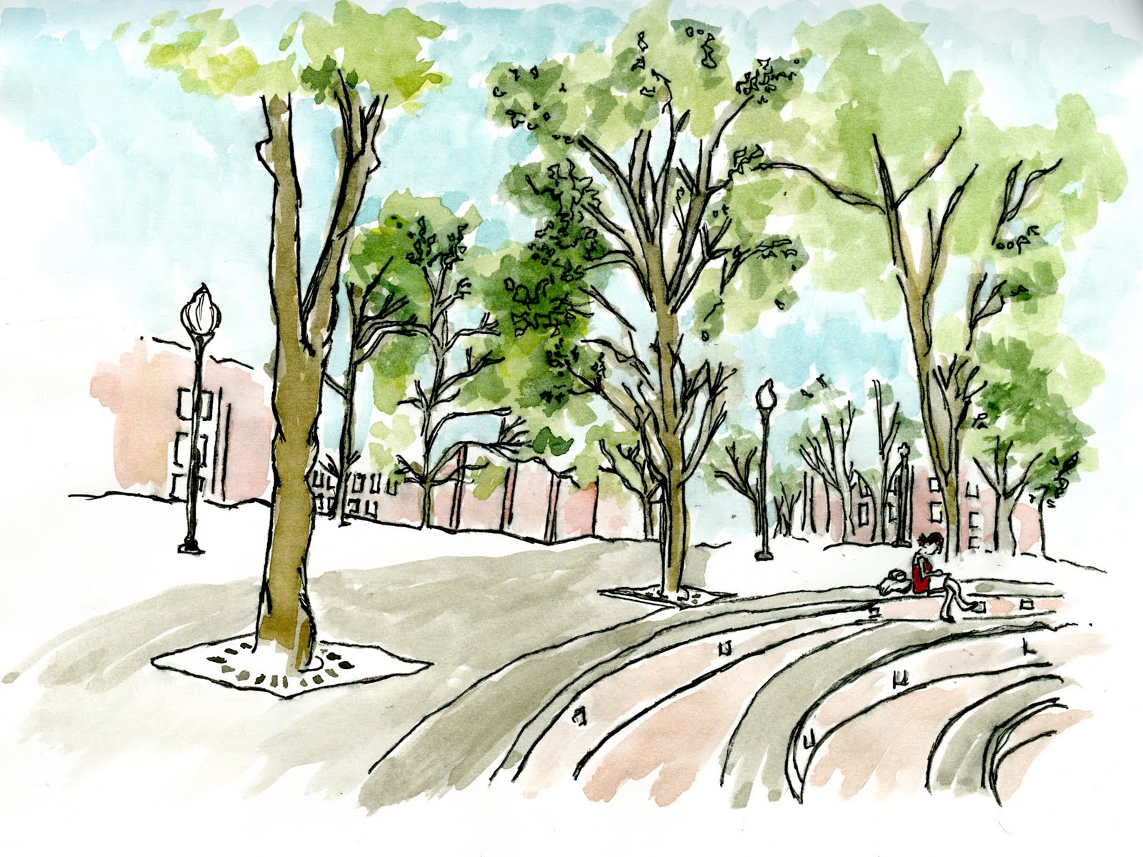
This is an extra credit water color piece that I have done for my drawing class... This is a perspective that is looking down gray drive from the top stair of the fountain outside of the caf!... P.s my Scale figure is my hunie pie NEDDIE! :D >> (Dajana Nedic)

Saturday, April 3, 2010

()n ALL FOuRS...


Furniture designed by MOI!! :) > believe it or not... this was done with my trusty dusty chart pack markers, pencil crayons and a pen!!! > A-MA-ZING right????!!?

Wednesday, March 17, 2010

H!Gh-GRaD3eeeee


1.water color painting , 2. drawing in pen, 3. cohesive layouts, & 4. DRAWING TREES.
I decided to title this one high grade because it is the Jamaican word for Tree's. Most people recognize it as mary jane but i don't think it would have the same effect.

Believe it or not, I'm just as bad at drawing trees as i am drawing people. BUT! practice makes perfect don't you think?? >> the piece simply speaks for it self!


BiLL!()Ns ()F BUTTONS :D !


I'M OBSESSED WITH BUTTONS. THE END. : )

G!MMi3 DETaiLs...

This is a cohesive collage of details that I had drawn in several locations. including: brick (( exaggerated and modified to my personal style)), a door knob, light fixture, wall paper and one of the famous beams in the Interior Architecture building!

Wednesday, March 3, 2010

EMPtin3SS...


FLiGHTs...

This is a piece I have created which has been inspired by the image below. I named it flights because it is a series of flights of stairs (even though I only chose to draw one.) The media I used was chalk pencils on gray-ish brown canson paper. This is a depiction of the staircase in the E.U.C of UNCG leading to the information desk.
By : Cathy Johnson