Saturday, April 30, 2011
Friday, April 29, 2011
Catherine...


I'm a loss for words except... Her dress was PERFECTION...
P.s > yes I'm guilty. I watched this morning! at 6 am :o .. but it was definitely worth it to witness a mark in history...
WaKA wAkA...
some one please help me!! I'm literally a year too late to start this obsession, but I am suddenly addicted to the world cup anthem created by Shakira.
I just adore the video.. the clothing used, the colors, the dancing, the atmosphere!
and thought I would share... :)
FiRst Y3aR R3viewS...
As a first year student we all come into this program fresh and new to the program. The amount of work and hours we must put in on top of the quality expected of us.
After the Tuesday First year presentations I felt that Danielle Mittman has the spirit of a dedicated student. Her deliverables as both a whole and individually were strong.
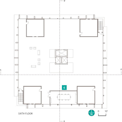
It was very clever to have three different floor plans. I appreciated the fact that you showed the technical floor plan, rendered and the exterior floor plan. I was sitting very far to the back and I could still see them clearly. [ Beautiful Rendered Floor Plan ]
Your perspectives were great however I feel that your title block was a little large and distracting. A word of constructive criticism would be that if you are going to leave white area's of space, exaggerate that technique next time. Focus on highlighting special area's with color and leaving the rest of the page white as if materials bleed only in that one spot.
It was smart to include exterior perspectives because it gives your audience the full experience therefore concluding the space as a whole.
Don't talk to the wall as much, your audience is in the opposite direction. It would have also been nice to see fully rendered elevations as it would have completed your project.
Over all I felt that your project was very strong and had a cohesive idea that showed through your deliverables.
(If you check out my blog you will notice that this semester I designed a unit with similar curves that I saw all throughout your space. It was ironic at how similar they were.)
Great Job. I look forward to seeing your work in the years to come.
Thursday, April 28, 2011
P()RTMANT3AU PRECEDENCE

collaboration Diagram between Trepide + Emerge


First Idea Sketch

Inspiration
Possible Site Choices...


P()RTMANTEAU
Presentation Boards
Perspective Rendering
Managers Office
Office
Lobby Perspective
Lobby Perspective
Laundry Room Elevation
Site Justification
On the edge of the world sits a place where culture, creativity, lifestyle and intellect thrive and shine as bright as the golden sand that lies on its beaches.
Standing on a measureless harbor that is ringed by a natural amphitheatre of hills is a city that sits on the north island of New Zealand.
Wellington, the capital city, embodies and reflects the concepts of movement and unrestricted flow of our structure as a whole.
The city is an artistic scene. Its picturesque surroundings prompt for walks around the beautiful harbor and hills.
Looking at the relationships and connections between the landscape and the structure, we interpret how the building relates to its surroundings through architecture. The climate is a temperate marine one that is generally moderate all year round, but the winds make it seem much colder than what the actual temperature may be. The natural winds of the landscape speak to the free flow movement of horizontal lines of the structure.
The nearby ocean represents ideas of translucency and reflection and is shown through materialization by the excessive use of glass.
The beaches represent a horizontal lifting within a semi-mountainous landscape.
Areas of near by terrain allude to a sense of traveling upwards and establishing a language of vertical lightness much like the one we depict through the structure with the idea of lifting upward through the use of vertical beams that swell in and out on all facades.
The color palette and material choice was particularly inspired by the natural terrain and surrounding buildings around it. Our design achieves a sense of unity and integration between the structure and the landscape.
Although Wellington’s population is 180,000, we ensure that our complex provides restricted access and privacy along with the benefit of extended stay. The attitude of the area, café culture and vibrant nightlife adds to the quality of living in such a place.
Conference Room Perspective
Atrium Perspective
Reception Perspective


Gestural Model


Model of Atrium Space

Model of the Customized Chair: Something Continues to Happen
scale 3" : 1'
Subscribe to:
Comments (Atom)


