Thursday, January 31, 2013

Water Break...

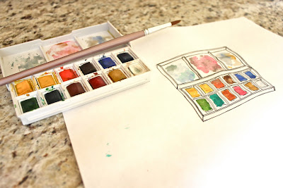
This water color break is OVER!
In light of the new fall season I felt that it was only right to brush off the cob webs from my trusty dusty paint set and get to work! - capturing natures most beautiful color schemes of the year!
...
SO get ready!!...Beacuse I have a feeling there will be plenty more paintings coming your way!

Wednesday, January 30, 2013

B0kjA C0LL3CtiOn


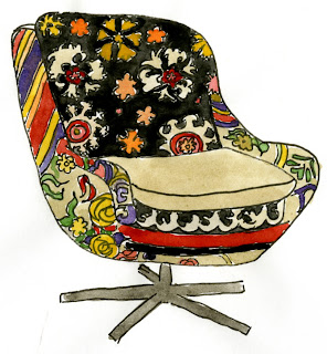
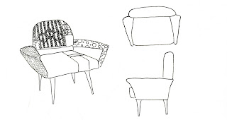
I used water colors to create these Bokja chairs! I love this reupholstered style of chairs! 

Monday, January 28, 2013

Water Colors for Rainy Days...

Rainy days are for : 
staying in bed, rubber duckies, oversized umbrella's, puddle jumping and... 
Water colors!! 

Just because its "ugly" outside doesnt mean you cant do something beautiful ;) 

Wednesday, January 23, 2013

GaM3s ()f HOT + C()LD : E.U.C


This is a bubble diagram that I sketched and painted of the Elliot Center at UNCG. This bubble diagram displays the flow of movement. I used three colors to indicate this. I strategically chose blue for area's that rarely have high traffic. Blue is a cool color, hence area's that are blue in the diagram are cold because people do not move through that area. I chose red for the area's of high traffic because red is a warm color. So area's with red suggest that it is hot with people. Lastly, I chose purple for area's that are in between. I cleverly chose purple because blue and red make purple and it only fits that purple is the in between color of red hot areas and cold blue area's


Monday, January 21, 2013

Saturday, January 12, 2013

Dr3ss LiK3 a CuPc/\k3 Sh(0)uLd F3EL...

I have been thinking lately about designing rooms 
(mainly because that is a project that i am working on in studio) 
And I wanted to decorate one of my spaces as airy + delicate as possible and the movie Marie Antoinette came into mind! I just love the set design and the choices of clothing that the designers decided on to help portray this high class historical woman!
Her room + clothing both speak the same language and they reflect her taste + personality which I just adore!  

... one day I will have a style as recognizable as hers was!


cupcakes (pen + water colored)by me! inspired by:
Marie Antoinette 

Monday, January 7, 2013

BAby F/\LL


Have you ever noticed that in the mirrors of a car there's a little clear sticker that says "things may seem larger r closer than they appear" >> ??? ... well even though this drawing of falling water seems big on my blog... its extremely small in my sketch book. This explains the title. : ) >> its my baby falling water.

Sometimes the best things come in small packages... in this case it would be "sometimes the most intricate things come in small sketches!"

Wednesday, January 2, 2013

P/\per PurSes...


"Design a container for a special object using paper, thread and fabric of your choice."
I decided to choose makeup ( general things of cosmetology) as my special object. This lead me to the idea of incorporating my actual design of my container with the special object.
I chose to make a little clutch (makeup bag) or purse for my special object, made out of magazine paper.
My ideas seemed to work well with each other because magazines have unlimited fashion in it from cover to cover and the paper it self has its own print on it, created by the contents printed on the paper.
I decided to use a "juicy couture" ad because it was very "fashionable" and colorful. As well as, juicy couture tends to use a thicker paper than the standard hot printed glossy magazine paper.
This was a plus because the thick paper made it easier to sow the paper and the fabric together.

I chose a loud color for my thread, so that it stands out from the design of the juicy couture ad. This gave the opportunity for the bonding to become apart of the design of my project.
For the fabric I used scraps of my friends jeans that she had just cut up a week before the assignment was given out. I feel that the design on the jeans was the perfect composition of patterns with the magazine ad.

After cutting the right size of fabric and sewing it onto the magazine paper, i decided to fray the top edges of the jeans to give it a "falling apart look." I could not decide on a latch for the purse to close and open... so after thoughtful consideration I noticed that if you turn the seam in the side of the pant leg horizontally, then it looks almost like a bow if cut to the right size.
So I sowed a little orange loop on the base of the purse for a little pink button to slip in and hold the bow to shut the purse.
I had carefully sowed the button to the bow, and sowed the bow to the top half of the purse.

Finally I gave the bow the same finish as the bonding thread on the side of the purse to complete the look i was going for.

T()DAY I WaS HAPPi3R ThaN A BiRD WITH a FR3nCH FRY...


Tuesday, January 1, 2013

FAsHi()N FATiGu3 ...


Behind enemy lines and into the new york apartment of a super model.

I decided to design my 3 part space for a fashionista... With a theme where army fatigue meets retro mod for the modern day. Its a tad bit too much going on for my likings BUT i must admit that the colors are seeping in and growing on me!